LLDCPDX logo Lionel LynnerDesign & Creative Start a project

Portfolio

15+ years of brands, websites, print and photography.

A sample of the work, grouped by kind. Full case studies live on request, most of this was made for real Portland & Oregon businesses over a decade and a half. My newest work is for local businesses that don’t exist, …yet.

Concepts

Portland bar and restaurant websites, self-initiated
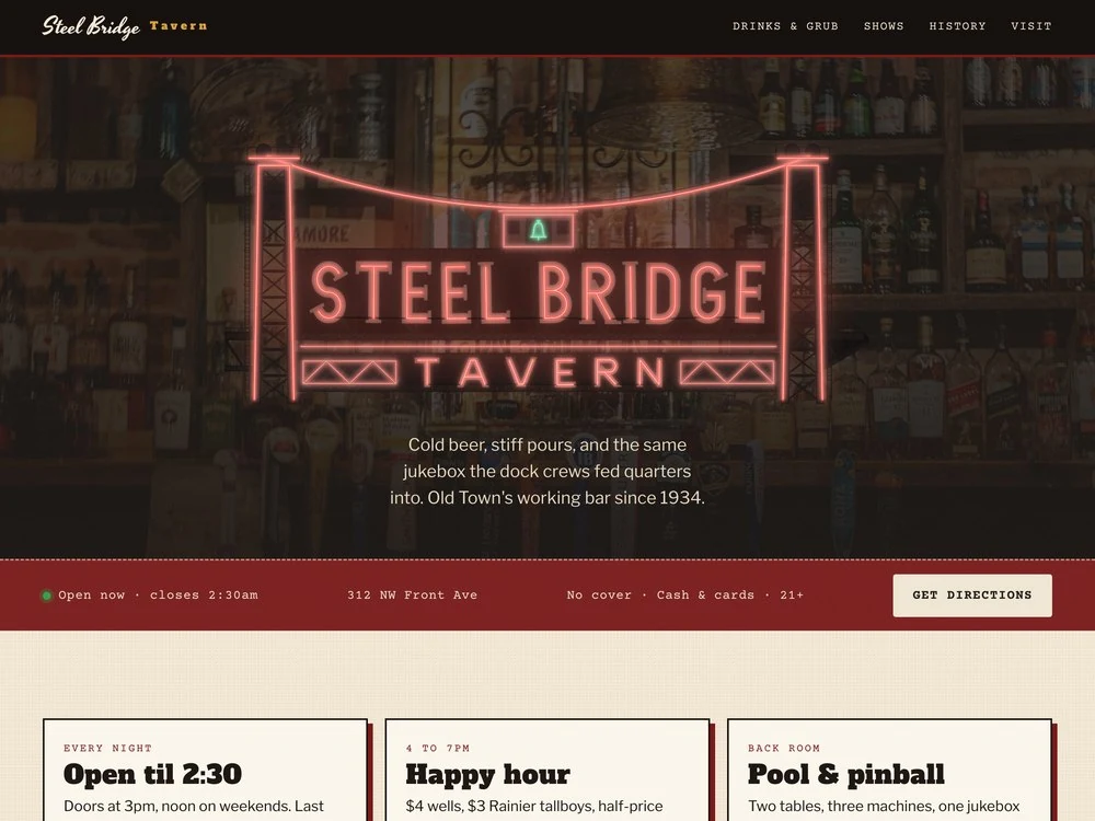
Website concept for The Steel Bridge Tavern, a fictional 1934 Old Town dive bar: the bar's red neon sign, drawn as the Steel Bridge lift span with towers, cables and a green bell, over a dimmed back bar, with an oxblood strip showing hours and address
Web design concept

The Steel Bridge Tavern

A made-up Old Town dive with real history under it: a neon sign drawn as the Steel Bridge lift span, a backstory that starts with an 1888 saloon on the same corner, and an hours badge that knows last call comes after midnight.

View live mockup ↗
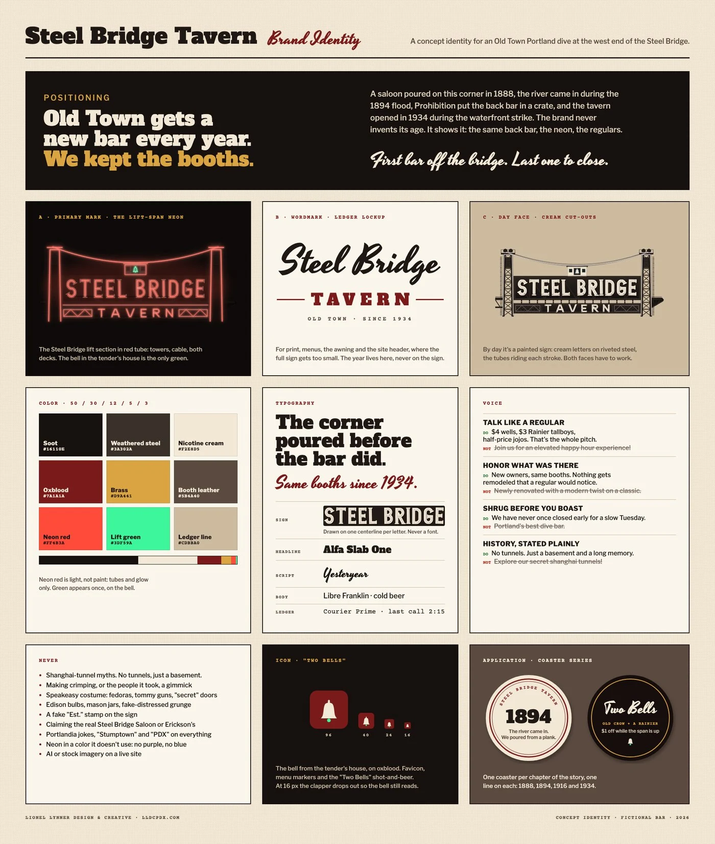
Steel Bridge Tavern brand identity board: the positioning line Old Town gets a new bar every year, we kept the booths; the lift-span neon sign by night and by day; a script and slab wordmark; a nine-color palette; typography with the hand-drawn sign letters; four voice rules; a never list; a bell icon; and two coasters
Brand identity concept

Steel Bridge brand system

The sign by day and by night, a wordmark that carries the year so the sign never has to, and a list of Old Town clichés it won't touch. No tunnels, just a basement.
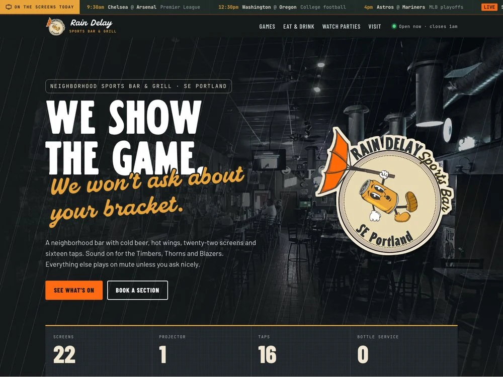
Website concept for Rain Delay, a fictional Southeast Portland sports bar: a die-cut mascot logo of a beer can hanging onto an inside-out orange umbrella, beside the headline We show the game. We won't ask about your bracket.
Web design concept

Rain Delay

A Grand Ave sports bar that sells the wait: a hand-drawn mascot, a live game ticker, rain on the screen, and a sound policy. Timbers, Thorns and Blazers get the volume. Everything else plays on mute.

View live mockup ↗
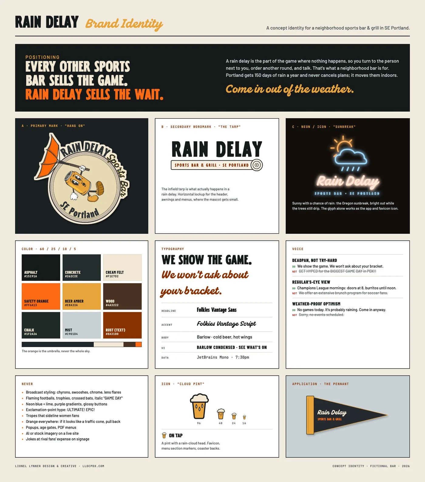
Rain Delay brand identity board: the positioning line Every other sports bar sells the game, Rain Delay sells the wait; three logo marks (a beer can mascot with an inside-out umbrella, a rolled infield tarp wordmark, and a pint icon with a rain-cloud head); a nine-color palette; Folkies Vantage typography; voice rules and a never list
Brand identity concept

Rain Delay brand system

Positioning, three marks, color, type and voice rules for the same bar, down to a list of things it never says. Tagline: come in out of the weather.
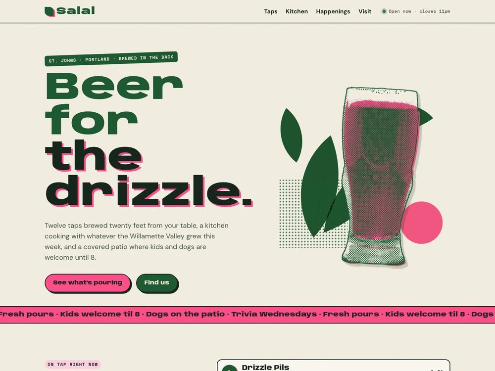
Website concept for Salal Brewing and Kitchen, a fictional St. Johns brewpub: chunky moss-green type reading Beer for the drizzle beside a two-color risograph-style illustration of salal leaves and a pink pint glass
Web design concept

Salal Brewing & Kitchen

A St. Johns brewpub printed in two inks, moss and pink. The tap list flags kegs as almost gone or kicked, and the headline handles the forecast: beer for the drizzle.

View live mockup ↗
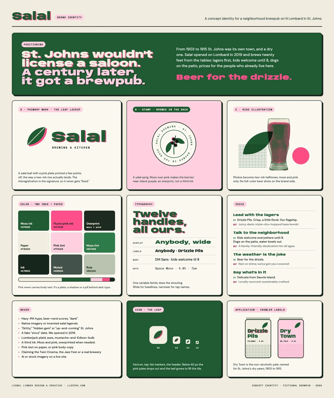
Salal Brewing brand identity board in moss green and fluorescent pink: the positioning line St. Johns wouldn't license a saloon, a century later it got a brewpub; a leaf-and-wordmark logo printed slightly off-register; a round Brewed in the back stamp with a salal sprig; a halftone pint; a two-ink palette with an overprint swatch; Anybody typography; voice rules; a never list; a leaf icon; and two crowler labels, Drizzle Pils and Dry Town
Brand identity concept

Salal brand system

Two inks, moss and pink, printed a little off on purpose. Plus a non-alcoholic pale called Dry Town, because St. Johns refused to license a saloon from 1903 to 1915.
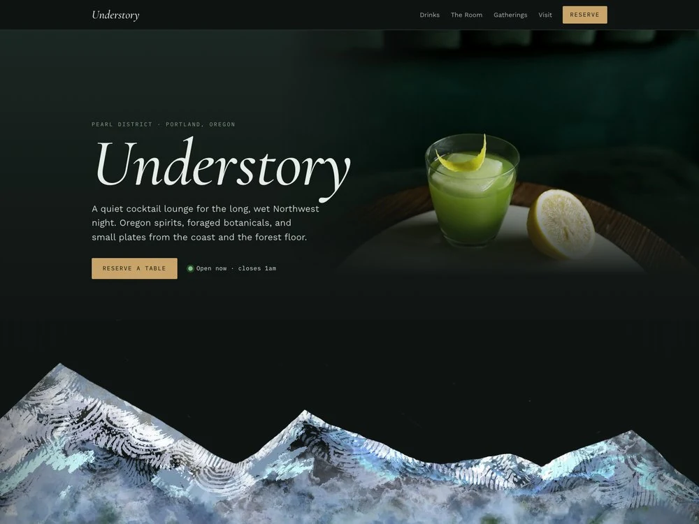
Website concept for Understory, a fictional Pearl District cocktail lounge: the name in large italic serif beside a green cocktail on a dark background, above Lionel's own Procreate painting of snowcapped peaks against a night sky, with mist and green forest below
Web design concept

Understory

A Pearl District cocktail lounge in a quieter voice, with my own Procreate painting of the Cascades rising out of the dark. Cocktails are listed like field-guide specimens, and the season gets one word. This fall it's Damp.

View live mockup ↗
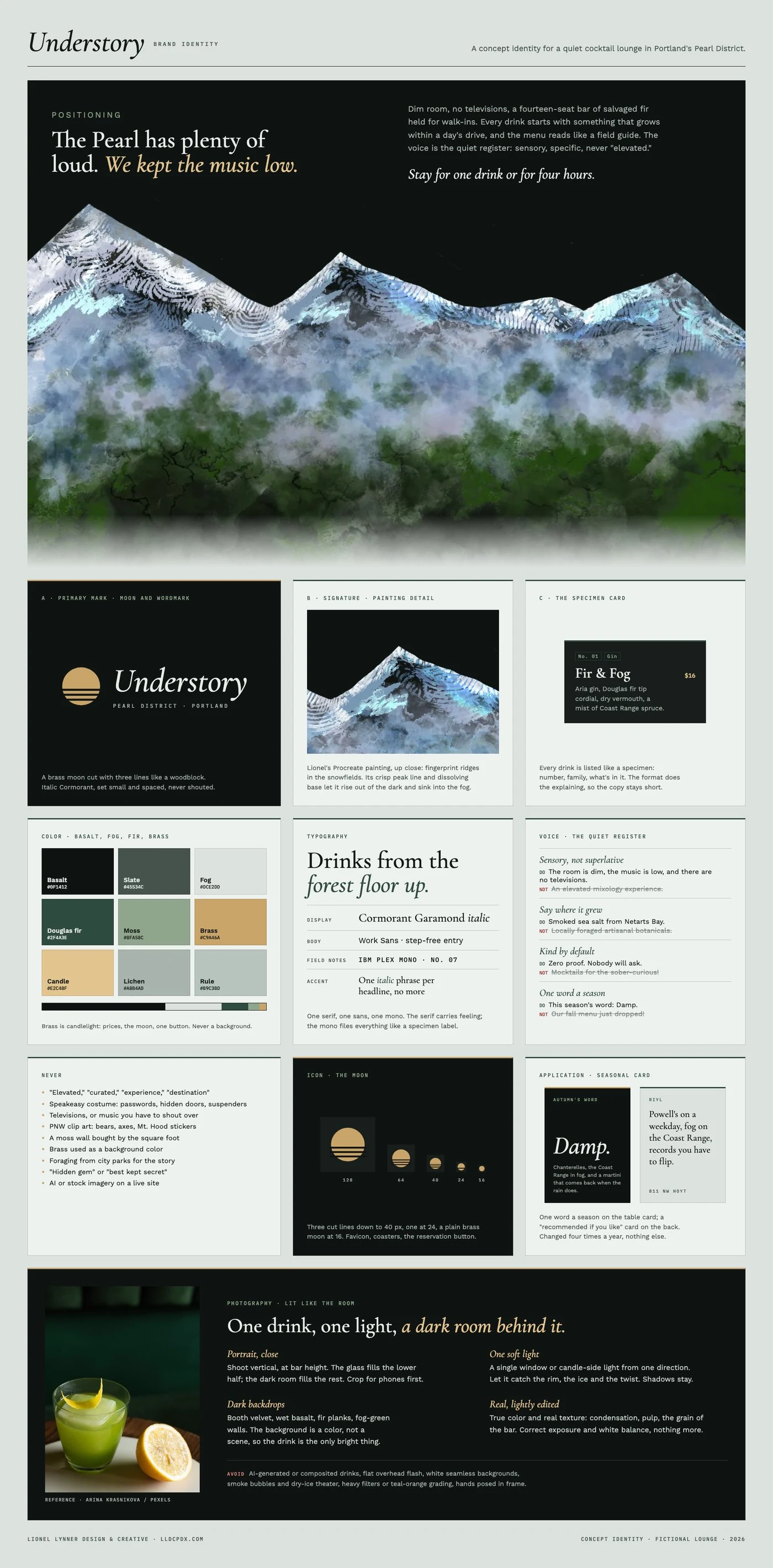
Understory brand identity board in basalt, fog, fir green and brass: the positioning line The Pearl has plenty of loud, we kept the music low, over Lionel's Procreate painting of snowcapped peaks against the night, with mist and forest below; a close-up of the painting's fingerprint texture; photography direction for dark, side-lit, portrait cocktail shots; a moon-and-italic-wordmark logo; a field-guide cocktail specimen card; a nine-color palette; Cormorant Garamond typography; quiet voice rules; a never list; a moon icon; and seasonal table cards reading Damp and RIYL
Brand identity concept

Understory brand system

The quiet one. My own painting of the Cascades as the signature, a brass moon cut like a woodblock, cocktails filed like specimens, and one word a season. This fall it's Damp.
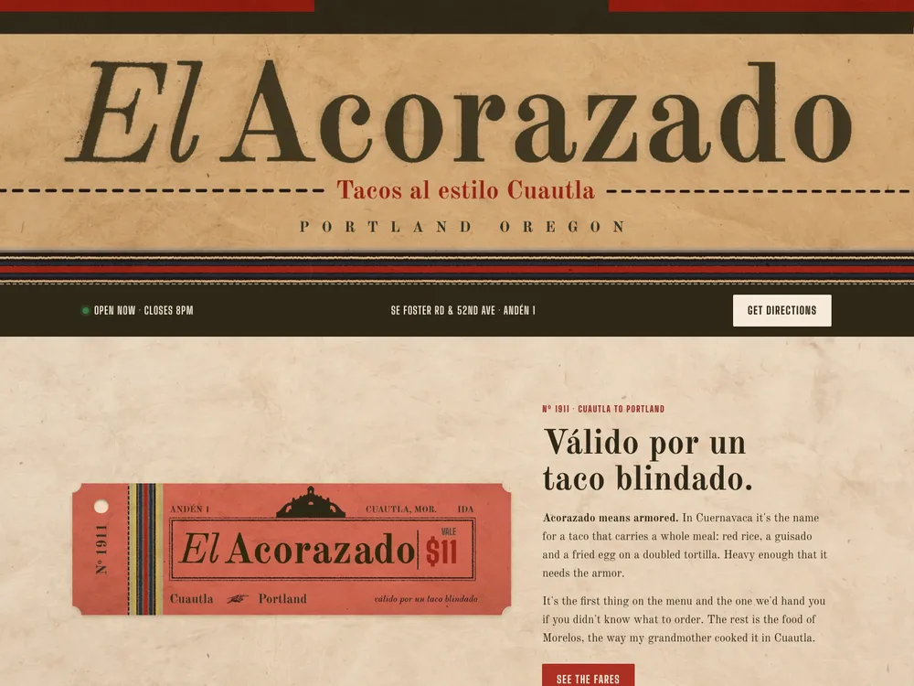
Website concept for El Acorazado, a fictional Morelos taco truck in Southeast Portland: the wordmark in dark ink on kraft paper over wool-colored stripes, a dark strip with hours and the cart pod address, and a coral rail ticket reading Cuautla to Portland, vale $11, beside the headline Válido por un taco blindado
Web design concept

El Acorazado

A Morelos taco truck at a SE Portland cart pod, run like a ticket window. The sign is the old Cuautla station, the menu is a fare board, and the ticket tilts under your cursor until the conductor punches it. The history gets tagged fact or as-told, because I'd rather not make it up.

View live mockup ↗
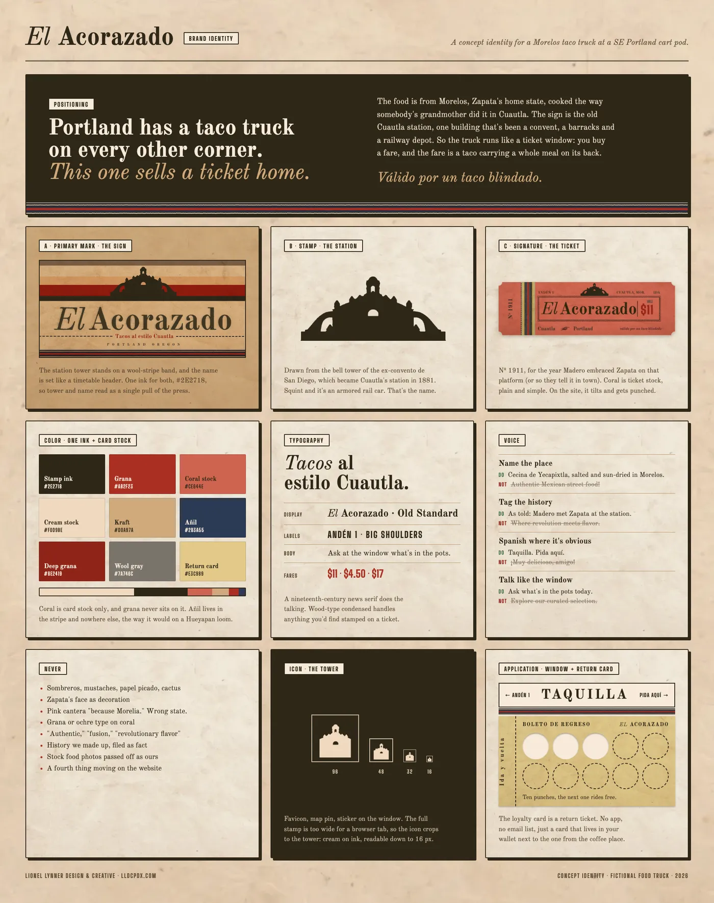
El Acorazado brand identity board in dark ink, grana, coral and kraft: the positioning line Portland has a taco truck on every other corner, this one sells a ticket home; the wordmark under the Cuautla station tower; the tower alone as a stamp; the coral rail ticket number 1911; a nine-color palette; Old Standard and Big Shoulders typography; voice rules; a never list; the tower as an icon down to 16 pixels; and a TAQUILLA window sign with a return-ticket punch card
Brand identity concept

El Acorazado brand system

One ink on card stock, a bell tower that doubles as an armored rail car, and a loyalty card that's a return ticket. Sombreros were never on the table.

Brand and website

Full identity + build
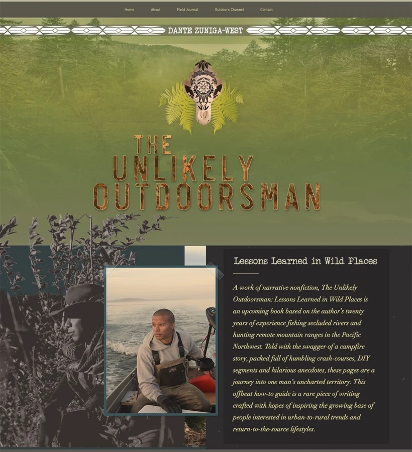
Website for The Unlikely Outdoorsman with a hand-lettered title over a forest photograph
Brand + Website

The Unlikely Outdoorsman

Identity and website for a forthcoming book of narrative nonfiction about fishing and hunting the Pacific Northwest.

Visit site ↗
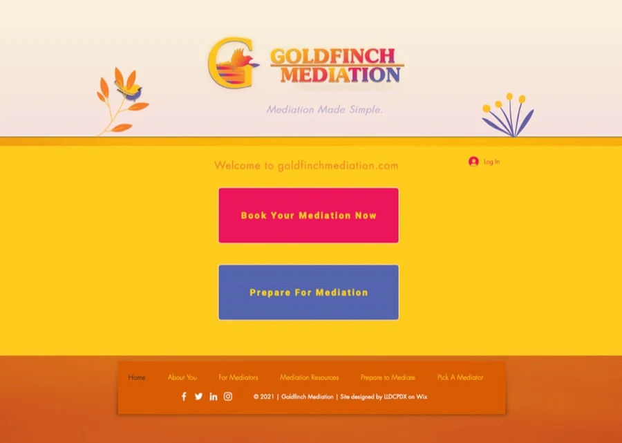
Goldfinch Mediation website with a yellow and orange palette and the line Mediation Made Simple
Brand + Website

Goldfinch Mediation

Identity and website built around one promise: Mediation Made Simple.

Business closed in 2023 View archived site ↗
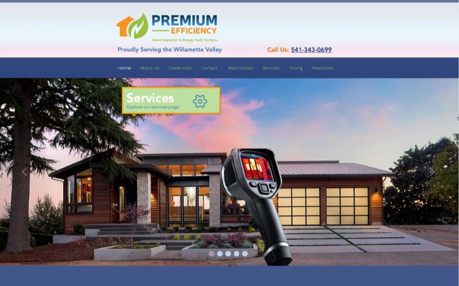
Premium Efficiency website showing a modern house and a thermal imaging camera
Website

Premium Efficiency

Website for a home inspection and energy audit company proudly serving the Willamette Valley.

Visit site ↗
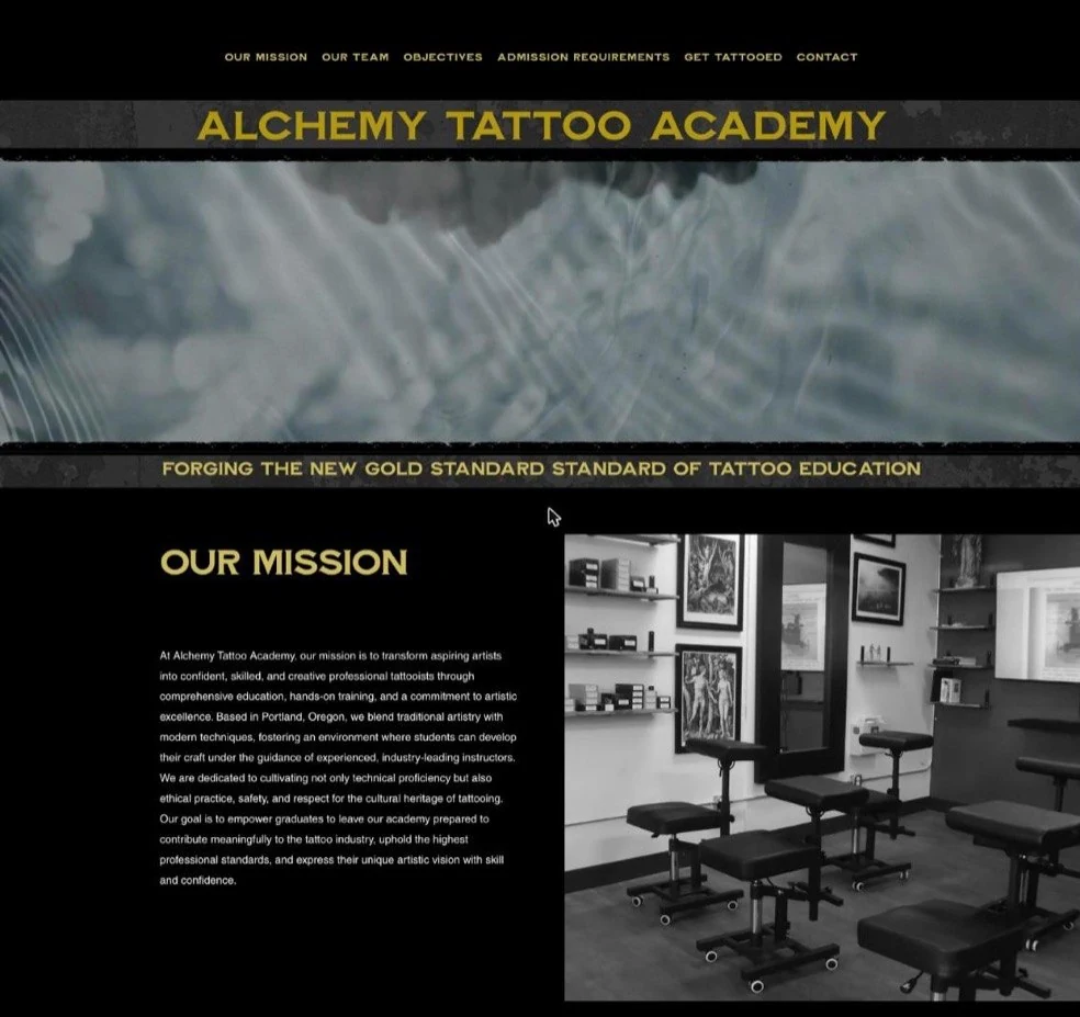
Alchemy Tattoo Academy website with a gold emblem over a smoke background
Website

Alchemy Tattoo Academy

Website for a professional tattoo training academy in Portland, Oregon.

Visit site ↗
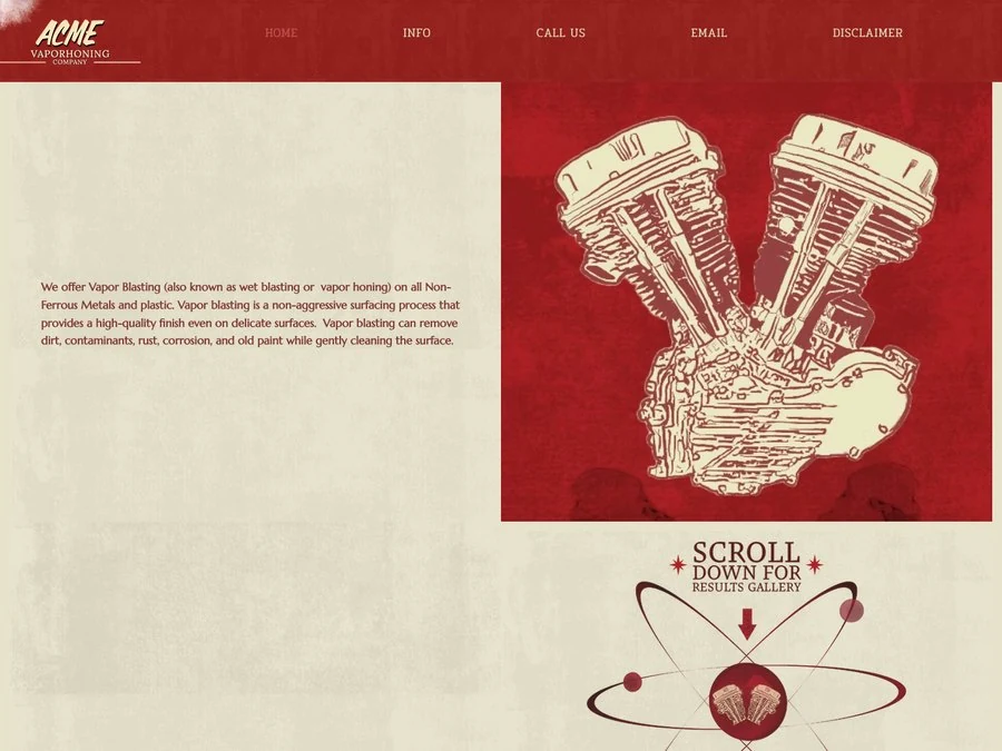
ACME Vaporhoning Company website: a distressed red header with the ACME wordmark, a cream panel describing vapor blasting, and an illustrated engine
Brand + Website

ACME Vaporhoning Company

Website for a vapor honing and metal restoration shop, built in the same vintage machine-shop style as the brand.

Visit site ↗
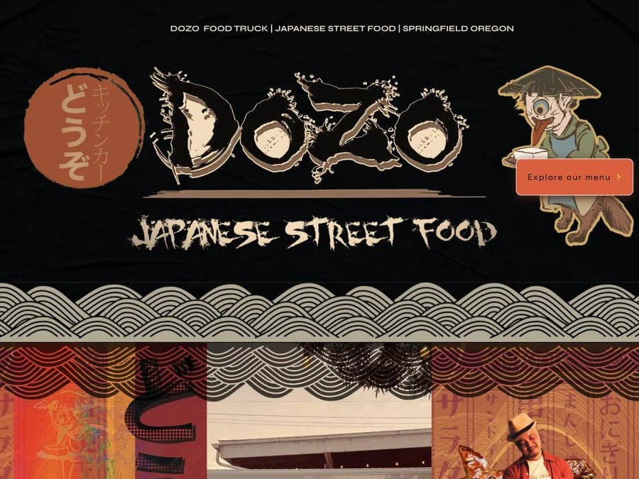
DOZO food truck website header: a brushstroke DOZO wordmark beside a red hanko-style seal, an illustrated mascot carrying tofu, Japanese Street Food lettering and a wave-pattern band
Brand + Website (original design)

DOZO Food Truck

Brand identity and original website for a Japanese street-food truck in Springfield, Oregon: a brushstroke wordmark, a hanko-style seal, an illustrated mascot and wave patterns drawn from traditional prints. 2022.
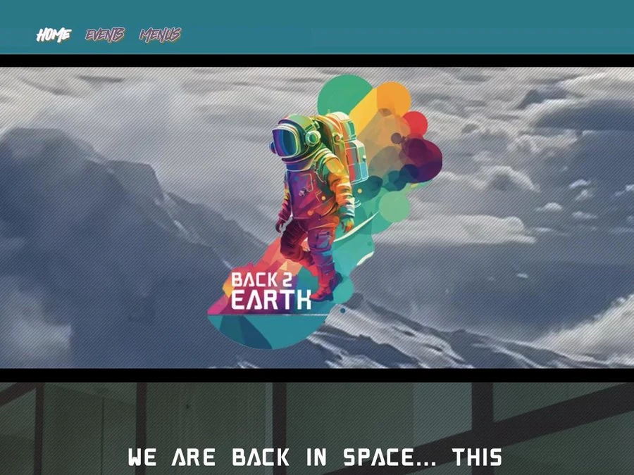
Back 2 Earth website header: a colorful astronaut logo with the Back 2 Earth wordmark over a snowy mountain scene, under a teal navigation bar
Website

Back 2 Earth PDX

Website for a queer bar and community space in Northeast Portland, with events, menus and a space-age look that matches the brand.

Visit site ↗

Logo and brand identity

Marks + guidelines
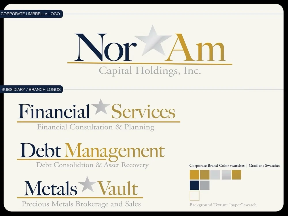
NorAm Capital Holdings brand board: corporate umbrella logo plus three subsidiary marks, Financial Services, Debt Management and Metals Vault, with a full color and gradient system
Logo + Brand

NorAm Capital Holdings

Full brand suite for a capital holdings firm, 2016.

Visit site ↗
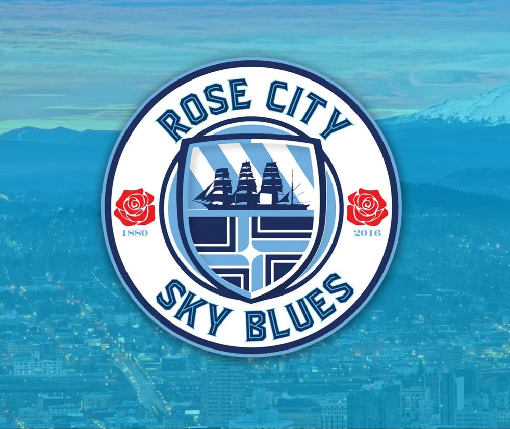
Rose City Sky Blues crest over the Portland skyline
Logo

Rose City Sky Blues

Crest for Portland's official Manchester City supporters club. Both are port cities, so the ship ties them together: Manchester's own crest carries an English merchant ship, and here a Chinese chuán stands for Portland's early trade with China and the Far East. The rose is a symbol both cities share.
Nebulous Taproom sign on a brick storefront
Brand + Logo + Website

Nebulous Taproom

Full brand identity, logo and website for the taproom, including a logo that holds up as a lit sign on the storefront.

Taproom closed in 2025View archived site ↗
Deater Foundation Inc logo, a tree with roots inside a circle
Logo

Deater Foundation, Inc.

Logo for a nonprofit that raises awareness and funding for research into HSAN1, a rare hereditary sensory neuropathy, in the hope of a treatment and cure. The tree and its roots carry the idea of growth from a shared origin.

Visit site ↗
Green Truck Grocery logo, a vintage delivery truck over a license-plate-style wordmark
Logo

Green Truck Grocery

A vintage delivery-truck mark for a Portland-area farm-to-table delivery service bringing local organic produce and goods to the door.
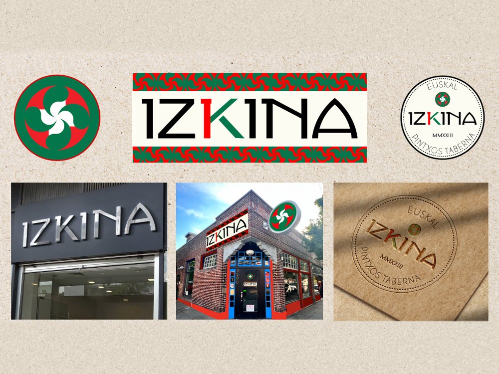
IZKINA brand board: a red, green and white lauburu mark, the IZKINA wordmark with a red and green K, a round Euskal Pintxos Taberna seal, and signage and stamp mockups
Brand + Logo

IZKINA Basque Pintxos

Brand identity for a Basque pintxos taberna, serving small plates in the spirit of tapas. A hand-built logotype and a secondary stamp mark drawn from traditional Basque emblems, with mockups for storefront signage and an embossed stamp on a high-end paper menu. 2023.
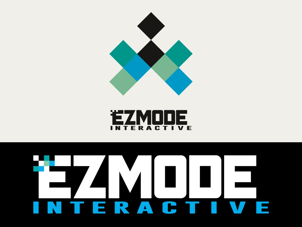
EZMODE Interactive logos: a stacked stamp mark of teal, blue and black pixel diamonds over the wordmark, and the horizontal EZMODE Interactive wordmark in white and blue on black
Logo

EZMODE Interactive

Logo for a studio starting out in full-scope video game development. A bold logotype with 8-bit pixel details, built to hold up on a black background and in print, plus a stacked stamp version. 2017.

Social media design

Match promos + story graphics
City v Madrid Champions League match promo graphic for GOL PDX
GOL PDX

City v Madrid, Round of 16

Match promo graphic for the pub's Instagram Stories.

Women's Euro 25 Final match promo graphic for GOL PDX
GOL PDX

Women's Euro 25 Final

Tournament final promo, part of a full match-day series.

Soccer Pub Quiz League promo graphic for GOL PDX
GOL PDX

Soccer Pub Quiz League

Weekly event promo, styled for repeat use.

Print and apparel

Posters, cards + merch
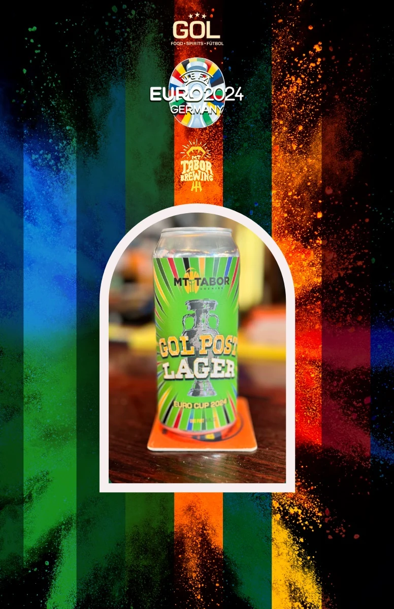
Promotional poster for GOL Post Lager, a Euro Cup 2024 beer by Mt. Tabor Brewing and GOL: the green can inside an arched frame over bold paint-splash stripes, with the GOL, UEFA Euro 2024 and Mt. Tabor Brewing logos above
Label design + branding

GOL PDX x Mt. Tabor Brewing

Promotional poster and beer label for GOL Post Lager, a Euro 2024 collaboration between GOL and Mt. Tabor Brewing, Portland.
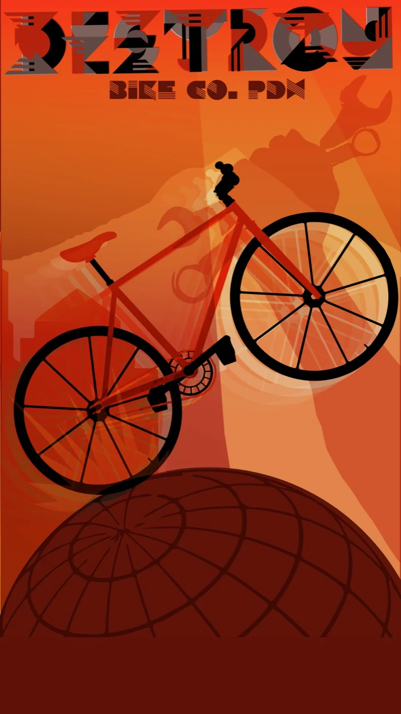
Destroy Bike Co. PDX poster: a geometric custom DESTROY wordmark over a red bicycle in silhouette, Mount Hood and a wrench-holding fist behind it, riding over a globe in orange and deep red tones
Poster + custom type

Destroy Bike Co. PDX

Propaganda-style poster for a Portland bike company, with vector illustration and a custom geometric display font.
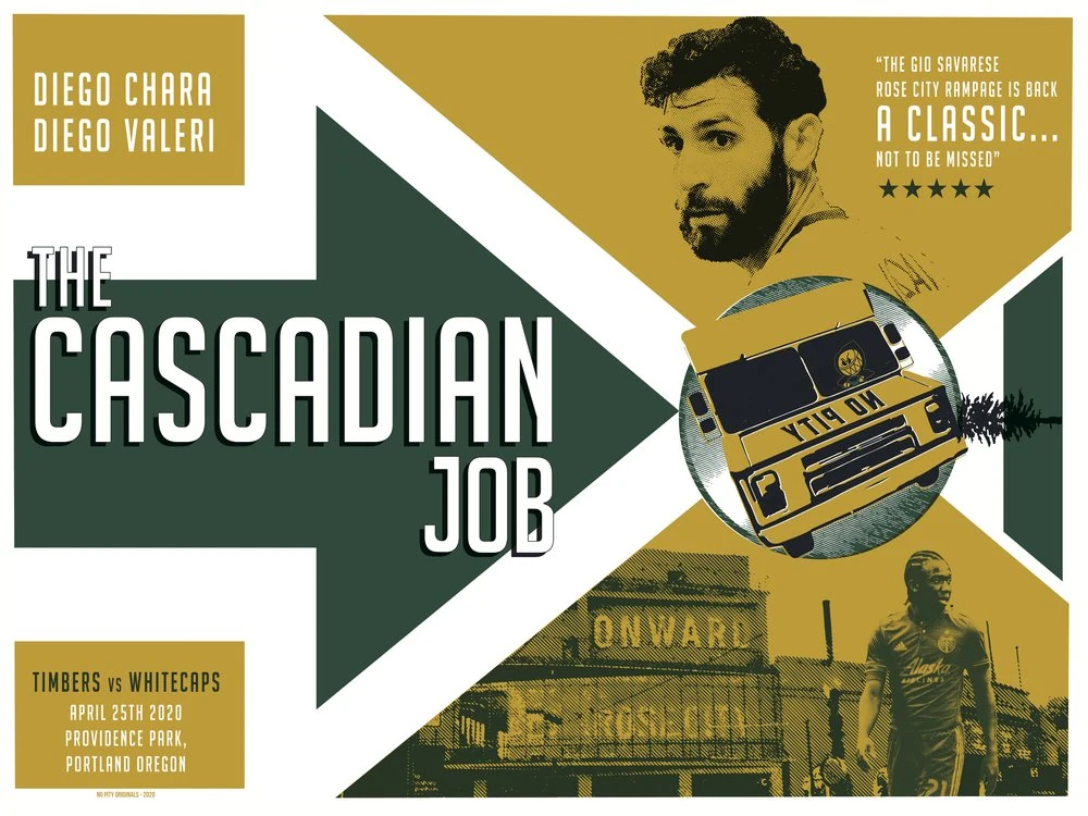
The Cascadian Job, a heist-movie-styled match poster for Timbers vs Whitecaps featuring Diego Chara and Diego Valeri
Event poster

The Cascadian Job

Match poster for Timbers vs. Whitecaps, styled as a heist-movie homage, Providence Park, April 2020.
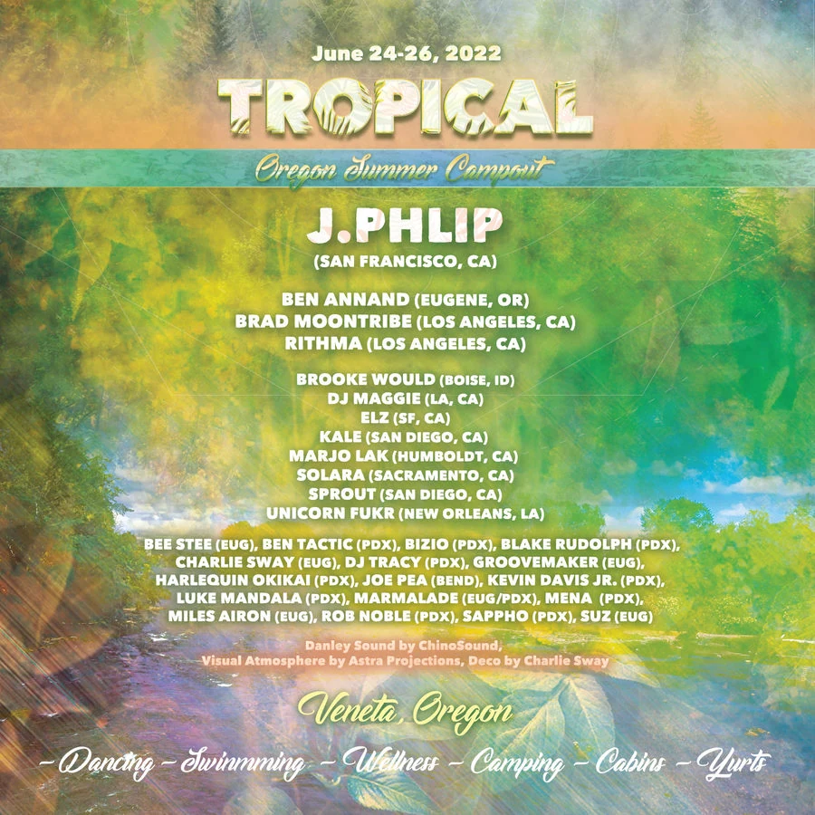
Tropical Oregon Summer Campout festival poster with a lineup list
Event poster

Tropical Oregon Summer Campout

Full lineup poster for a multi-day music campout, Veneta, Oregon.
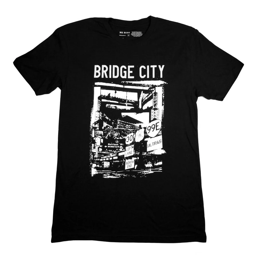
Bridge City graphic t-shirt design for No Pity Originals
Apparel

Bridge City, No Pity Originals

Screen-print design for a Portland-themed t-shirt.
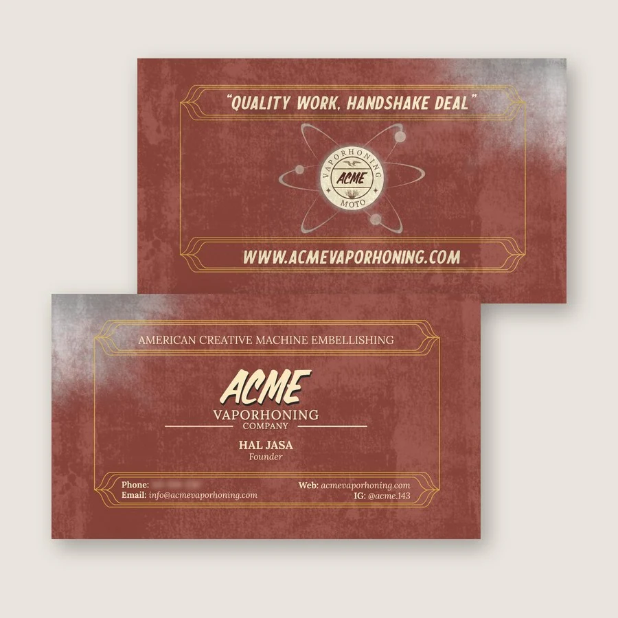
Front and back of the ACME Vaporhoning Company business card: distressed red stock with gold frames, the ACME wordmark on the front and an atom badge logo on the back
Branding + print

ACME Vaporhoning Company

Two-sided business card with a vintage machine-shop feel, carrying the ACME wordmark and atom badge.

Visit site ↗
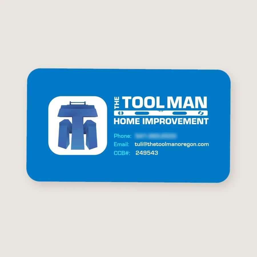
The Tool Man Home Improvement business card: a bright blue card with a 3D T-shaped tool logo and a level-bar wordmark
Branding + print

The Tool Man Home Improvement

Logo and business card for Tuli, an Oregon home improvement contractor, built around a carpenter's level.

Photography

GOL PDX World Cup + #Portlandscapes
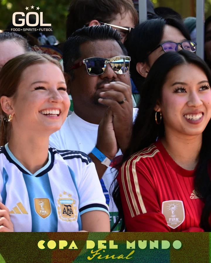
GOL PDX Copa del Mundo Final graphic over a photo of two fans
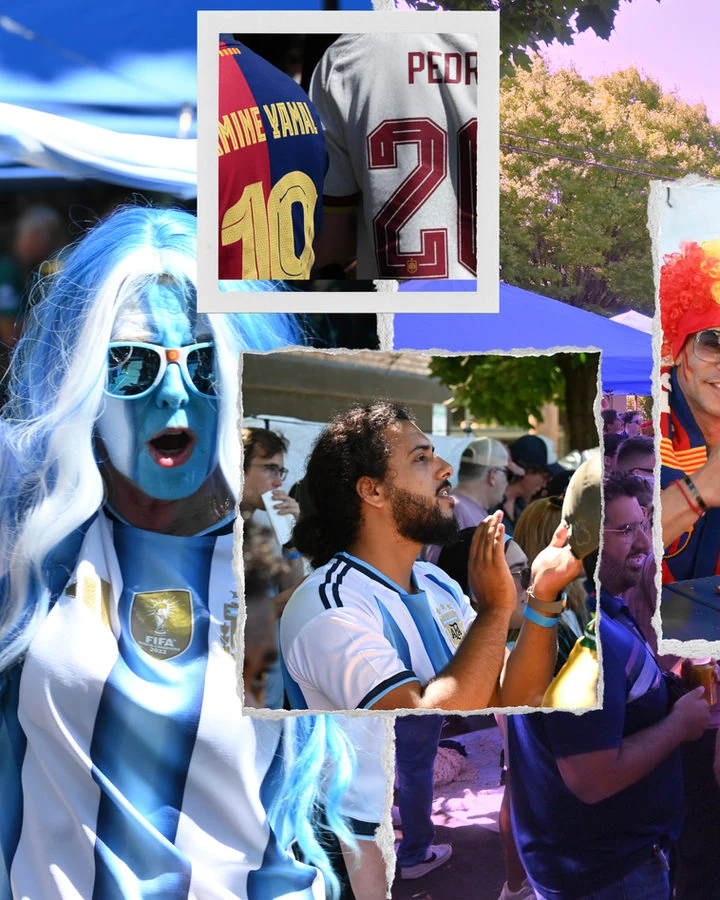
Collage of World Cup fans in torn-paper frames
Fans in Spain colors framed in a torn-paper collage
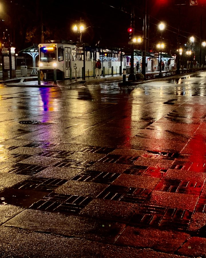
Rain-soaked downtown Portland street at night, streetcar lights reflected in red and gold
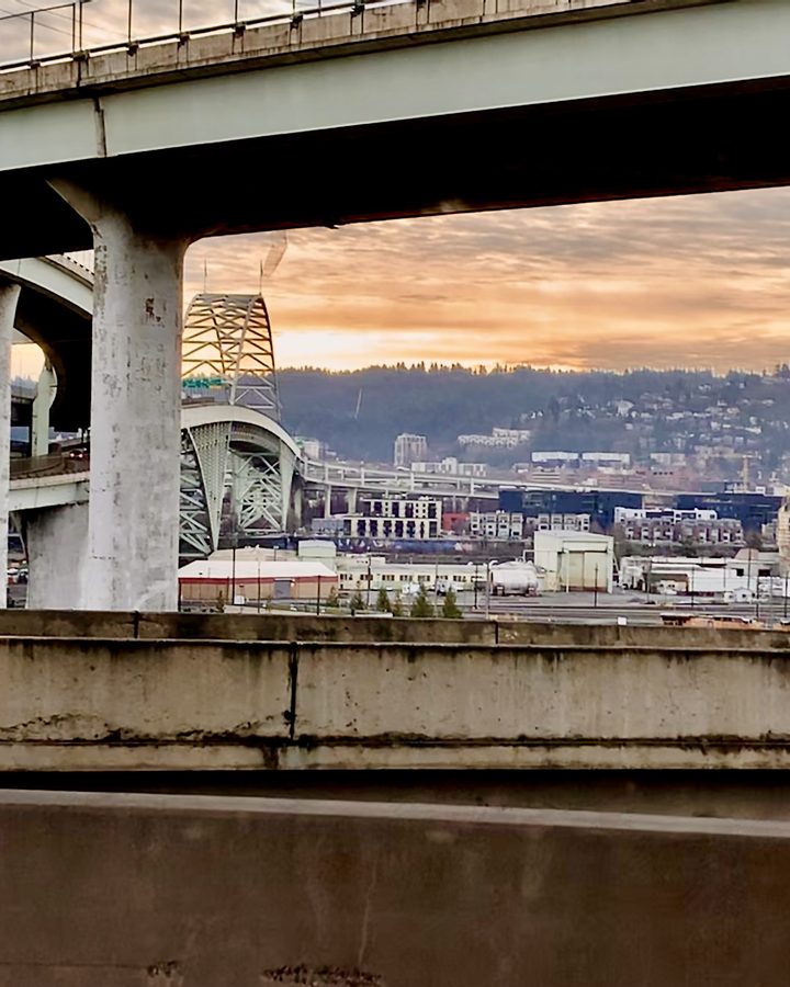
Portland's Fremont Bridge and the city at dusk, seen from under a freeway overpass
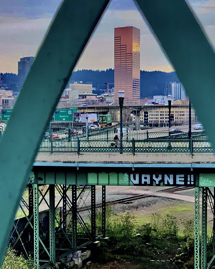
Green steel bridge truss framing a downtown Portland skyline
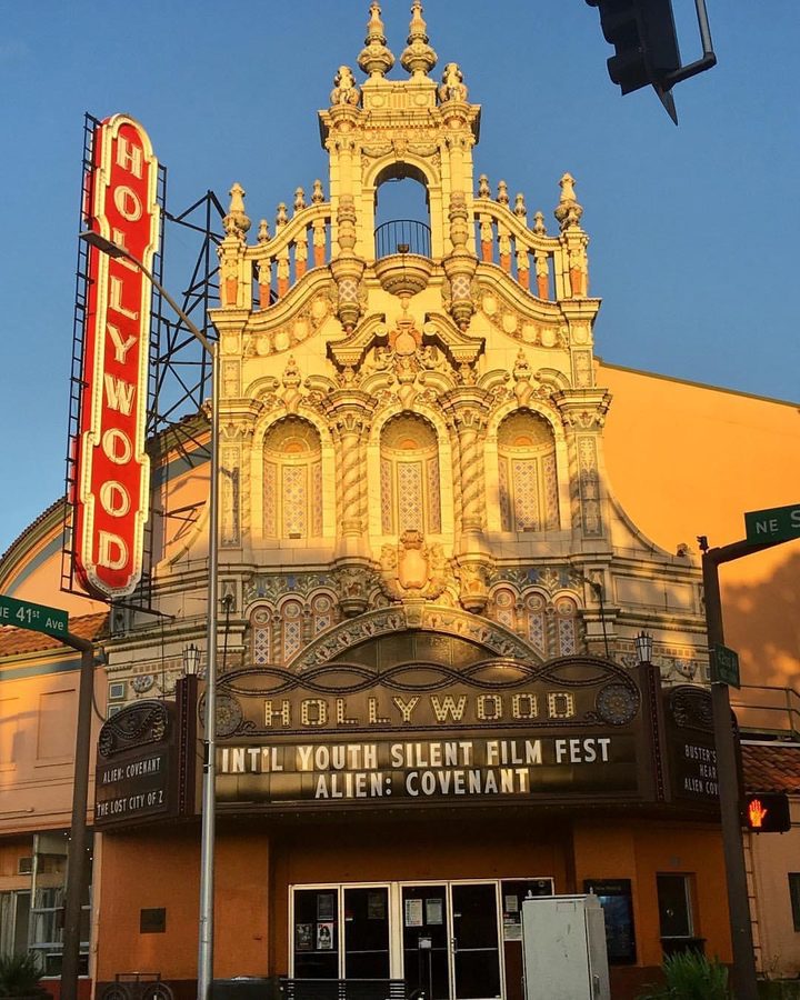
Hollywood Theatre's ornate facade and neon marquee in Northeast Portland
Graffiti-tagged I-5 sign pointing to the Morrison Bridge, Salem and Seattle under storm clouds

Have a project in mind?

Start a project